Earth observation
Satellite maps trace El Niño’s heat and ocean-colour changes
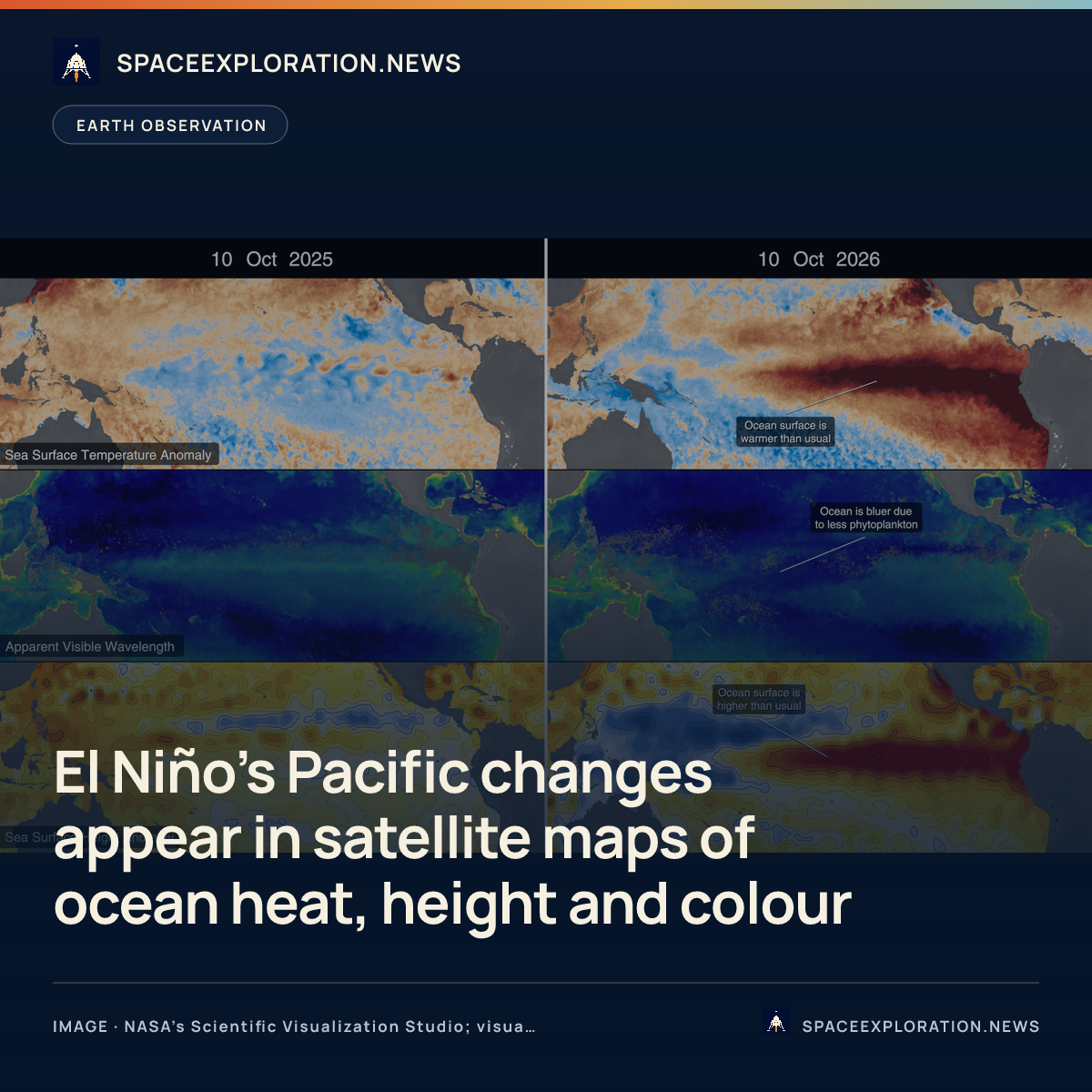
NASA’s October 15 comparisons link ocean heat and height measurements with colour changes associated with fewer phytoplankton across the tropical Pacific.
Add us as a preferred source on Google Add us as a preferred source on Google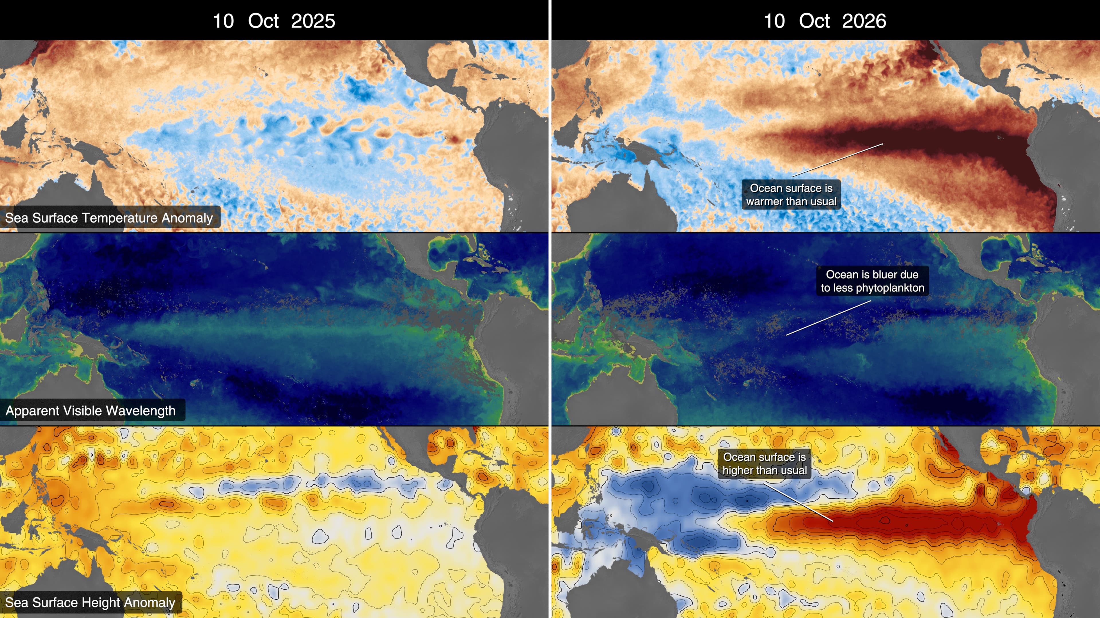
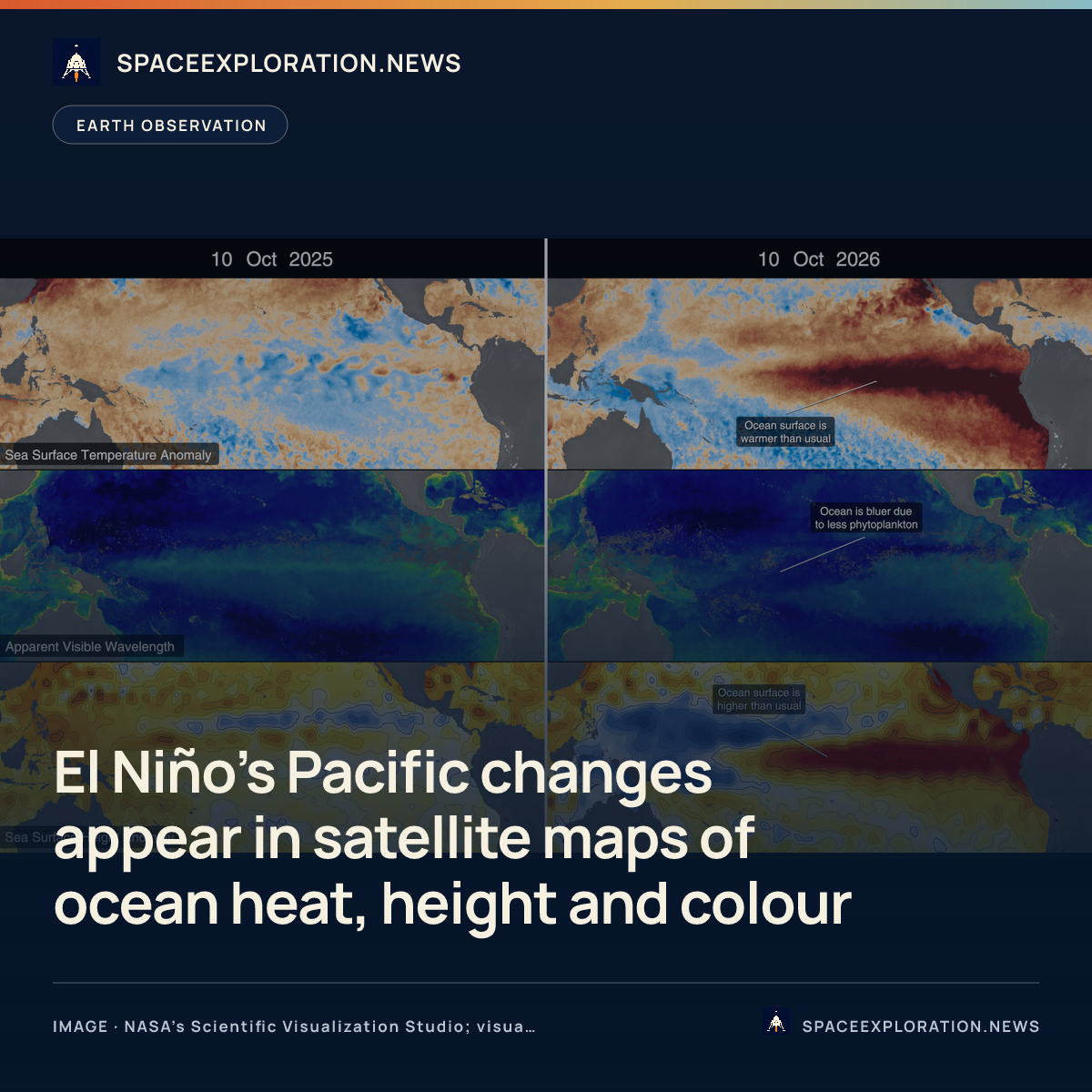
Satellite maps released by NASA on October 15 show warmer surface water, elevated sea levels and a shift toward bluer ocean colours across the tropical Pacific as El Niño develops. The comparisons bring together measurements of the ocean’s physical conditions and changes associated with reduced phytoplankton, the microscopic plants that support marine food webs.
NASA’s Scientific Visualization Studio compares the same months in 2025 and 2026 using three products: sea-surface temperature anomalies, ocean colour and sea-surface height anomalies. The 2026 temperature maps show a warm band across the central and eastern tropical Pacific, contrasting with cooler conditions in 2025. Height maps show an elevated band across the same region.
The height measurements come from the Sentinel-6 satellites, NASA explained. Warm water expands, and the agency described local sea levels as much as 30–40 centimetres above normal in some areas, while levels around Indonesia and northern Australia were 15–20 centimetres below normal. These are regional departures, rather than a uniform rise across the ocean.
NASA put eastern Pacific surface temperatures at about 1.7 degrees Celsius above the long-term average. Its temperature comparison combines satellite instruments with buoy and ship sensors, so the product does not rely on spacecraft measurements alone.
The ocean-colour view comes from the Ocean Color Instrument on NASA’s PACE satellite. NASA explained that weaker trade winds reduce the supply of nutrient-rich deep water reaching the surface. Phytoplankton become less abundant, changing the ocean’s colour; a decline can also force marine life to seek other feeding grounds.
In the studio’s comparison, bluer shades generally indicate less phytoplankton, while green and yellow suggest higher concentrations. The maps therefore show different aspects of the event: temperature, the height of the surface and an optical signal associated with marine life.
NASA said it will continue monitoring the signs and impacts of El Niño with its Earth-observing satellites. The agency described ocean heat and moisture entering the atmosphere and altering weather patterns worldwide.
Reporting trail
Primary sources
For an image post, download the card and copy this suggested caption.
NASA’s October 15 comparisons link ocean heat and height measurements with colour changes associated with fewer phytoplankton across the tropical Pacific. Read the full report: https://www.spaceexploration.in/news/nasa-el-nino-satellite-ocean-observations #SpaceExplorationNews #SpaceNews #SpaceScience